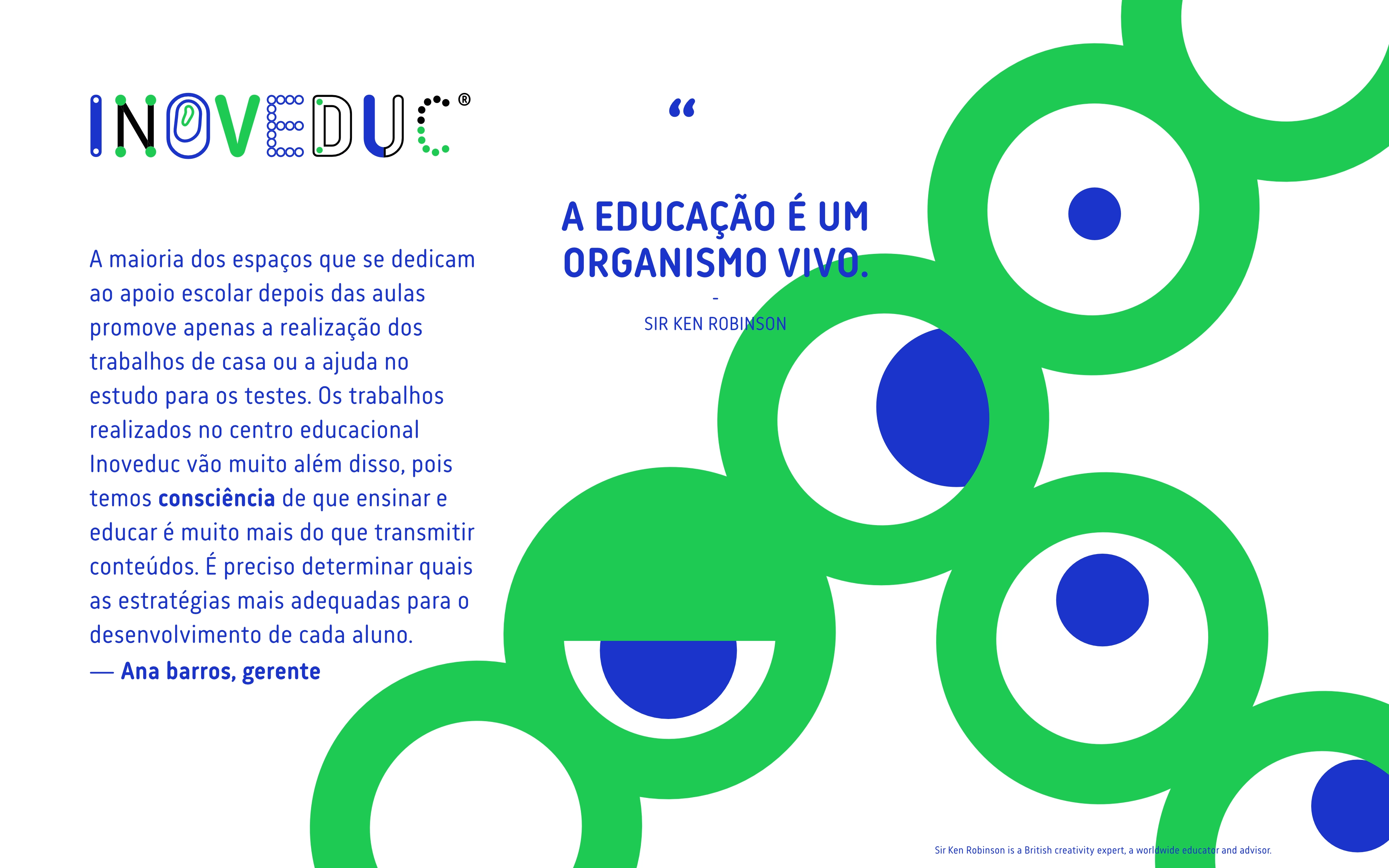
Inoveduc Visual Identity
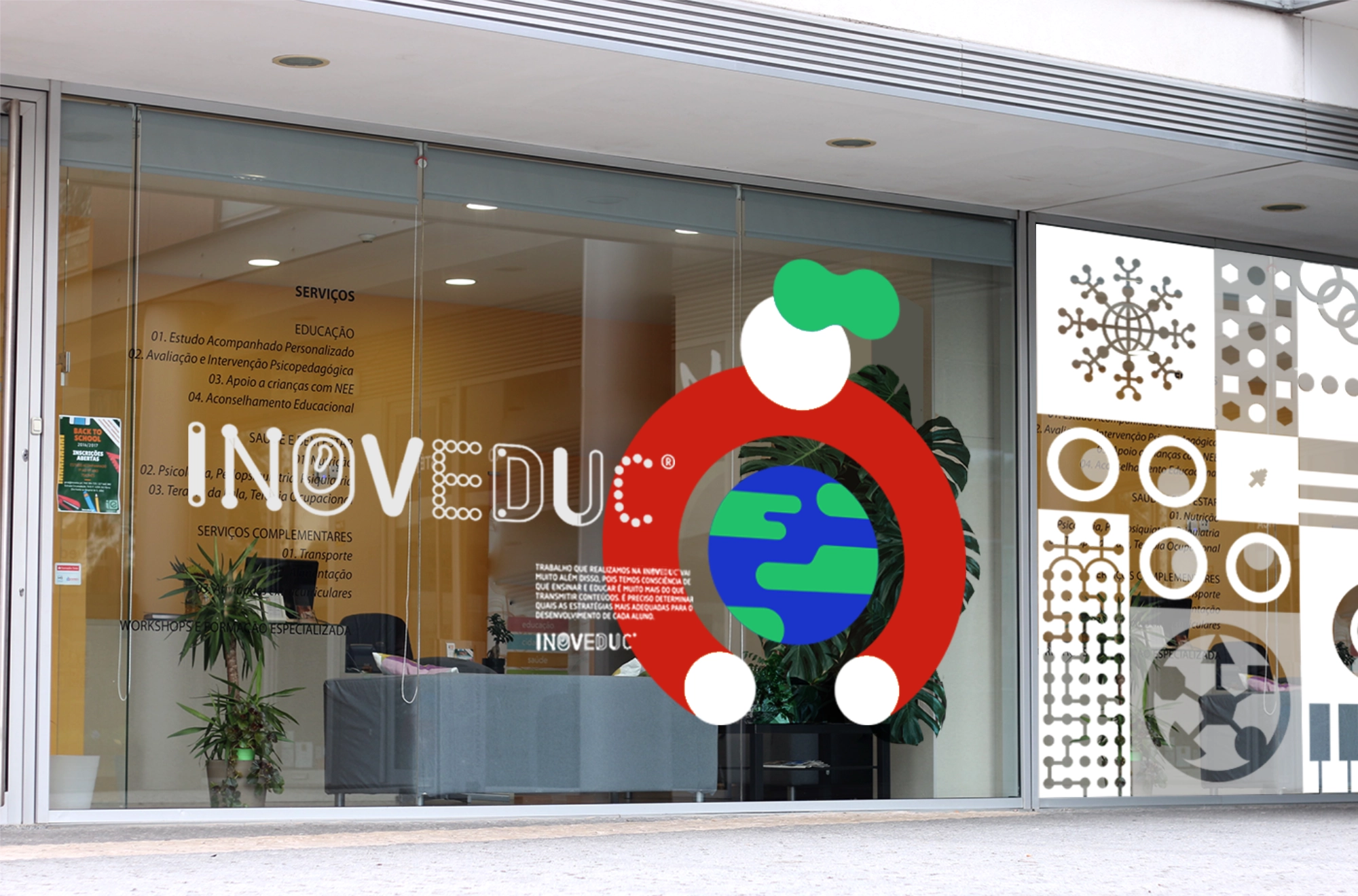
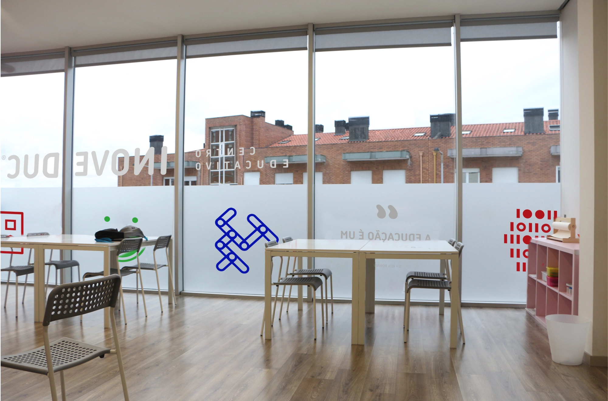
Inoveduc came with a manifesto: education is a living organism. Their Porto-based educational center doesn't just help students with homework — it builds individualized learning strategies from primary school through university entrance. Their brand needed the same logic: adaptable by design, always recognizable.
Client
Inoveduc
Commissioner
Ana Barros
Creative Direction
Eduardo Barbosa
Design
Felipe Magario
Illustration
Eduardo Barbosa

“Teaching and educating is far more than transmitting content. It requires finding the right strategy for each student.”
— Ana Barros, Manager
Logo and Marks
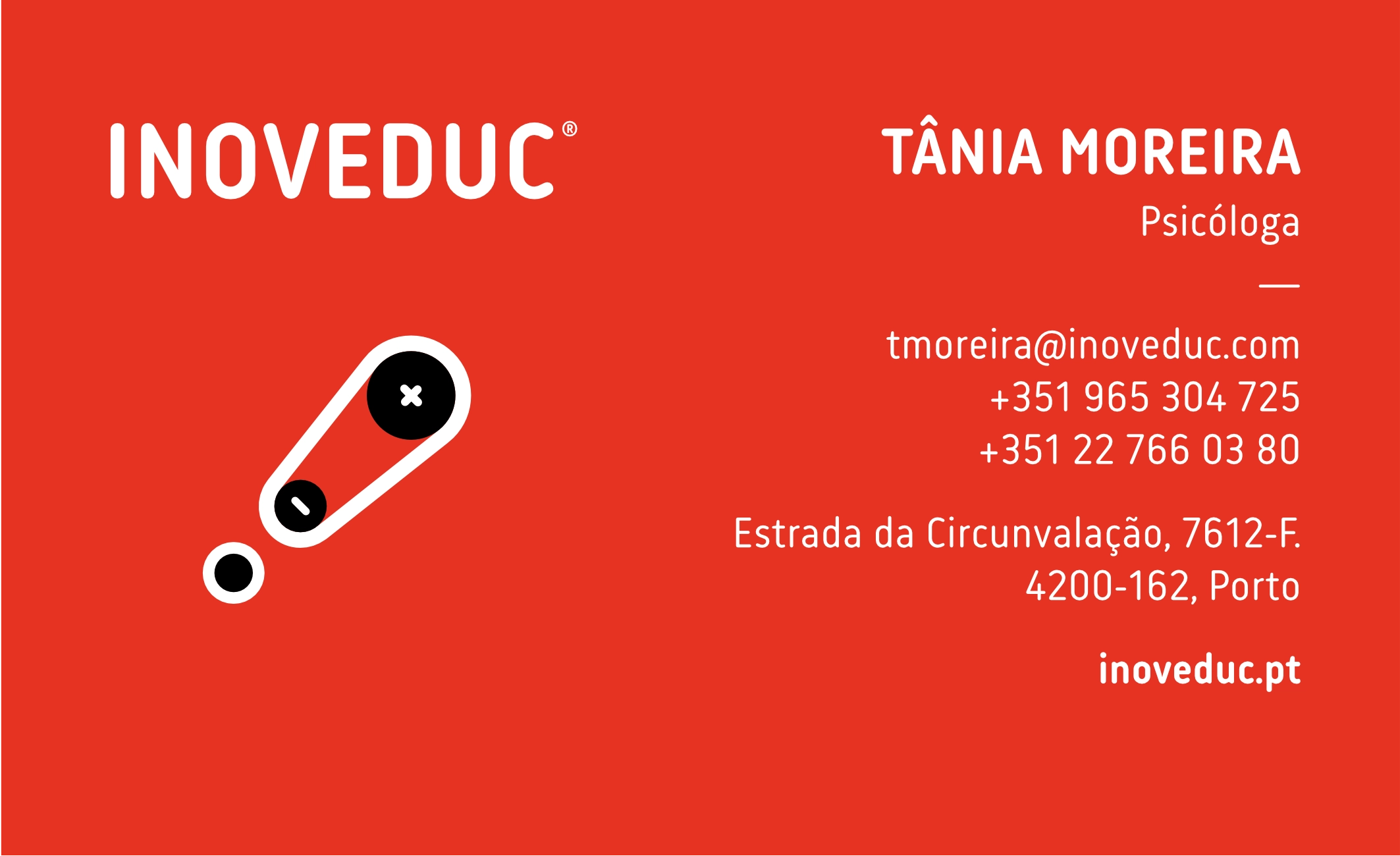
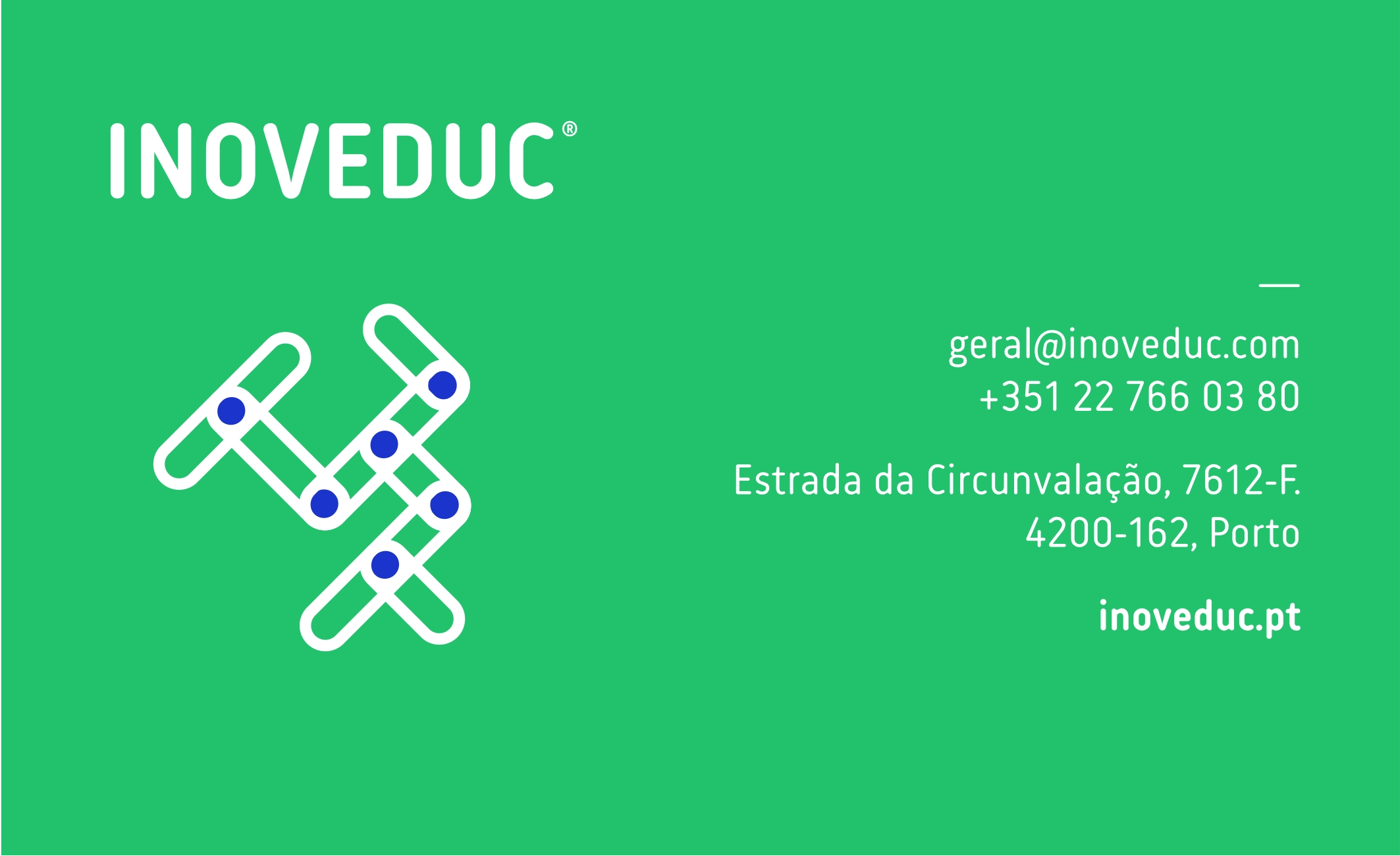
A modular wordmark where icons replace letterforms depending on context — six icon sets representing different disciplines: health, robotics, mathematics, music, mechanics, and binary code. The logo doesn't repeat itself; it reconfigures. The identity guide was written not as a rulebook but as a framework for invention.


Posters


Business Cards


Identity Guide


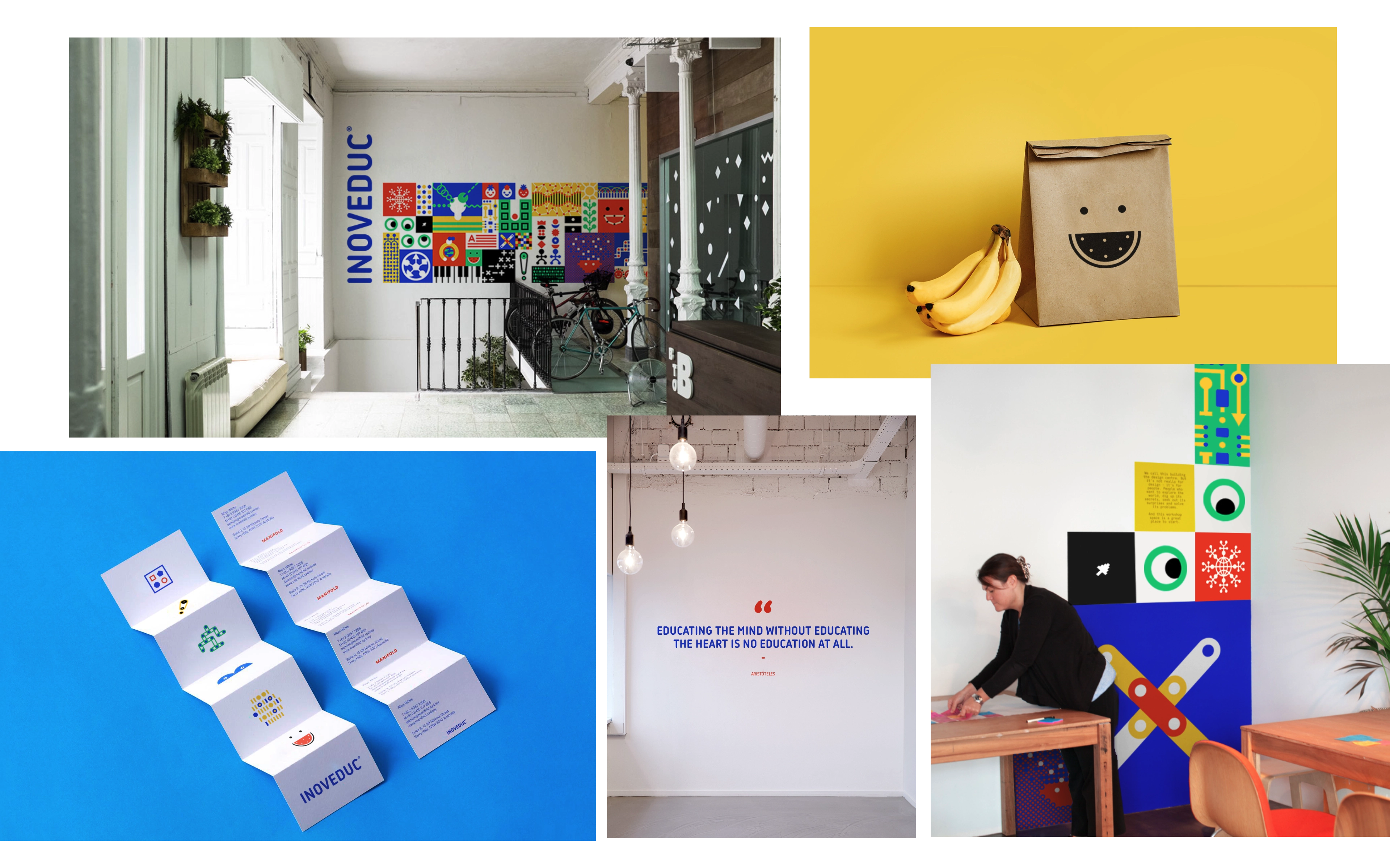


In place